DCP, or Desktop and Control Panel to give it it’s full moniker, is checked out by delusional and found to be at worst servicable.
 |
|
|
|
||||
DCPIn which delusional changes another shell Those that know me will know that I am a great fan of customising nearly everything, and that this passion extends to all things computer like. One glance at my desktop will tell you that. Not just the wallpaper, but the entire shell is changed. So when I saw shell replacements for the Psion, I had to have a go with them. The first thing to explain is just what a shell seeks to do. It is a replacement way to use your machine. In the case of the Psion, it replaces the System screen with its own interface. In the case of DCP, the main screen is similar to the Windows Desktop, with a bar to the base of the screen and an area above it that can be filled with icons. However, DCP uses the bar for a different thing than windows. Rather than listing active tasks, it is more of a toolbar than a taskbar.
As the shot above shows, there are quite a lot of buttons to learn. However, it’s easy to spot the one needed amongst the crowd. The buttons are oragnised into groups, which make finding the right one easier, although Windows style tooltips would sometimes come in useful! These buttons provide access to the main areas of the program, and there’s quite a lot of stuff waiting to be found. Aswell as the desktop funtionality, there is also an agenda app, similar to a very high powered Today view, a file browser, with two pane, drag and drop file management, a contacts manager, a calculator and a small applet to help managing phone calls.
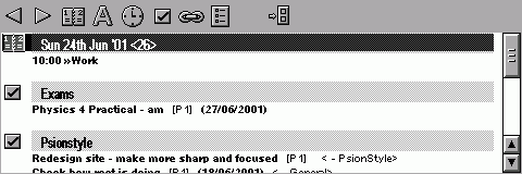
With the exception of the phone call manager, which doesn’t really seem to belong, these small app-within-an-app programs are very useful. The Today one shows all the appointments and todo’s for the day in one long scrolling pane, making it quicker to browse through than the Revo’s one. Appointments and todos can also be added, existing ones can be edited, although editing is restricted to non-repeating events, so you can’t completely leave Agenda. This part of the program is very well done, and soon becomes one of the most used screens in the program.
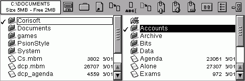
The file browser is also a step forward. It is two paned meaning that items can be dragged between the panes. This is one of the more popular ‘power-user’ programs on the PC, and it is a powrful way to manage files. However, it is generally easier to use the usual System screen to open files, rather than manipulate them. The Desktop is another very powerful tool. As well as making links to applications and files, links can be created to almost anything else within the program. Contacts and Agenda entries can be added as links, useful to remind you to call someone or go somewhere! When more detail is reqired, ‘stickies’ can be stuck to the desktop. These are sticy notes, and expand to fit the text is entered into them. For longer missives, note links can be used. These look like normal shortcuts, but when you tap them an editing window is opened so more detailed notes can be made. However, although these notes can hold alot, having more than a few lines seems to slow down loading of the note into the edit window. Finally, there is the Pen tool. This allows writing directly onto the Desktop with a stylus, good for phone numbers and such. There’s also an eraser for removing the scribbles. DCP supports multiple Desktops, all with their own wallpapers (16 grays can be used, unlike in the System screen!), links and scribbles. These can all be assigned hotkeys to enable quick swtching between them. The time is also displayed on the desktop, along with the date. This is usful to have, however the way it is displayed means that some valuable space is lost, especially on the Revo screen. DCP also includes many little touches that are of great help. There is the ability to use ctrl-tab to swap between running apps, which is a welcome addition. Special mention, however, has to go to the handling of the System silkscreen button. Most applications are content to take is over, so when you hit System, their app pops up. DCP takes a much better approach. The first System tap brings up DCP, but the second brings up the System screen. A third tap returns you to DCP. This small feature is a great examle of the small touches that make this program so enjoyable to use. The program is not perfect, however, but over all the small glitches are minor compared with how the rest of the program impresses. One of the major problems is the lack of printing support. It would be great if a file listing for a folder could be printed, or printing of the agenda for the day. There are options for manageing battery levels and the backlight, but there is no option to manage the remote link. When external power is present the link could be switched on, and switched off when the power supply is removed. This would be of great use to Revo owners, as the charger is built in the the docking station. DCP is also very frequently updated. During the months testing for this review, the version number went from 7.63 to 7.86. Requested features are often implemented, sometimes within a week if it’s a minor request. This means that the program has very few bugs and is generally intuitive to use. A final mention should be given to the level of integration between DCP and the other Corisoft applications. For example, associate an agenda entry with a project in DCP and it appears in the Project’s view in ProjXpert. This kind of integrated functionality is very powerful, and will hopefully be copied elsewhere as it works well. In conclusion, DCP is one of the more useful programs on the Psion. If you want a viable alternative to the System screen, it should be high on your list to check out. It does what it needs to, and, despite the high number of features, runs very smootly.
|
||||
| Latest News |
|
Nokia Redesigns the Mobile Phone
Pocket PC 2002 Upgrade for European Users
|
| Latest Reviews |
| Latest Comments |


